Walt Disney Concert Hall - Frank Gehry
- Ayush Mishra
- Dec 20, 2022
- 6 min read

Project Specifications:
Location: | Los Angeles, United States |
Studio: | Gehry Partners LLP |
Design: | Frank Gehry |
Built in: | 1999–2003 |
Area: | 157,000 Ft2 |
Category: | Concert Hall |
The Walt Disney Concert Hall, designed by the architect Frank Gehry, opened in 2003 after many years of gestation.

The history of the building began in 1987 when Lillian Walt Disney, widow of businessman donates $ 50 million to start building a philharmonic hall. The idea was to create a reference point for music, art and architecture, which position the city of Los Angeles in the cultural level.
The proposed Gehry was chosen after an international competition in which they were submitted over 70 proposals. The architect imposed its characteristic style, which can be seen in the rest of his works. While the construction of this building is later, the design was done before the Guggenheim Bilbao. Walt Disney Concert Hall is now the permanent headquarters of the Los Angeles Philharmonic.

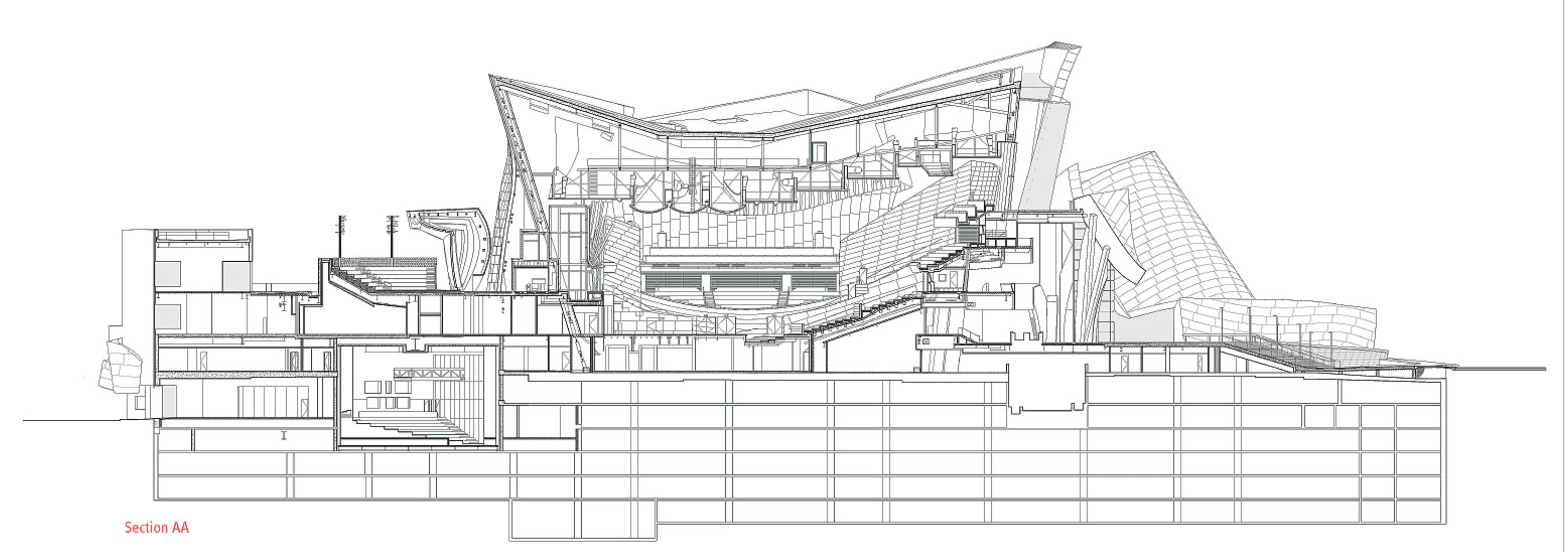
The concert hall was designed as a single volume, with orchestra and audience occupying the same space. Seats are located on each side of the stage, providing some audience members with distant views of the performers’ sheet music. The former director of the Los Angeles Philharmonic felt boxes and balconies implied social hierarchies within the audience, and spatial segregation was minimized in the design. Curvilinear planes of Douglas fir provide the only partitions, delineating portions of the 2,265 member audience without creating visual obstructions. The steel roof structure spans the entire space, eliminating the need for interior columns. The organ stands at the front of the hall, a bouquet of 6,134 curved pipes extending nearly to the ceiling. It is the unique result of a collaboration between Gehry and Manuel J. Rosales, a Los Angeles-based organ designer.

Design Philosophy :

The design represents the style of their creator, architect Frank Gehry, could be considered a work of art in itself. The extravagance of its forms seems to defy any rules of harmony and symmetry. The forms are external inspired by a boat with sails drenched.

The building is essentially a shell which consists of a series of interconnected volumes, some form of orthogonal coated stone and other forms of organic and surfaces covered with a corrugated metal skin of steel. As a bridge between the different volumes are used glazed surfaces.
The centerpiece of the interior of the building was designed to represent the hull of a boat. The idea of the architect was to design a room with an evocative sculptural forms of music, achieving an intimate connection between the orchestra and audience.

The building also fulfills an important role in urban areas. The exterior is a composition of undulating and angled forms, symbolizing musical movement and the motion of Los Angles. The design developed through paper models and sketches, characteristic of Gehry's process. The custom curvature demanded a highly specific steel structure, including box columns tilted forward at 17º on the building’s north side. Visitors can glimpse the steel frame through a skylight in the pre-concert room and view the supporting structure from a stairway leading to the garden.
The reflective, stainless steel surface engages light as an architectural medium. The facade's individual panels and curves are articulated in daylight and colored by city lights after dark. The building was initially set to be clad in stone, but a more malleable material was chosen following the completion of the Guggenheim Museum Bilbao, the concert hall's titanium-clad cousin. Thin metal panels allowed for more adventurous curvature and could be structurally disassociated from the ground. The metallic forms appear to hover above an asymmetrical band of glazing at the building’s base. Glass fissures in the facade bring light into the lobby and pre-concert room, reading as a grand entryway through the otherwise opaque facade.
Material & Façade :
To coat the outer surfaces were used corrugated 12,500 pieces of steel together on the outside. No two equal parts, as each piece takes a unique form of agreement to their location.

In areas outside of regular forms, the stone was used. Glass surfaces function as a liaison between the various volumes. The interior of the auditorium and rooms, is lined with fir wood. This is the same type of wood that is used in the back of violin, cellos and violas. Here was used in floors, walls and ceilings.

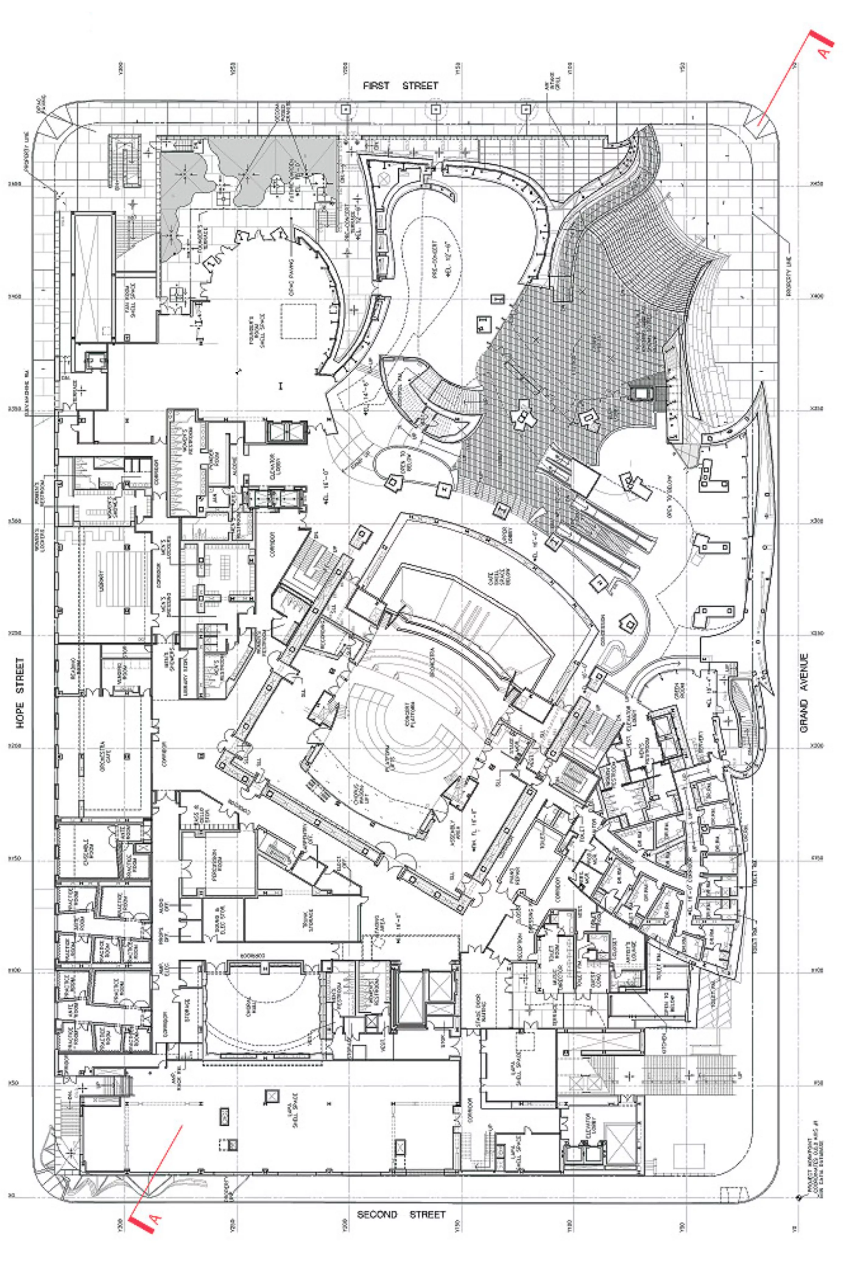
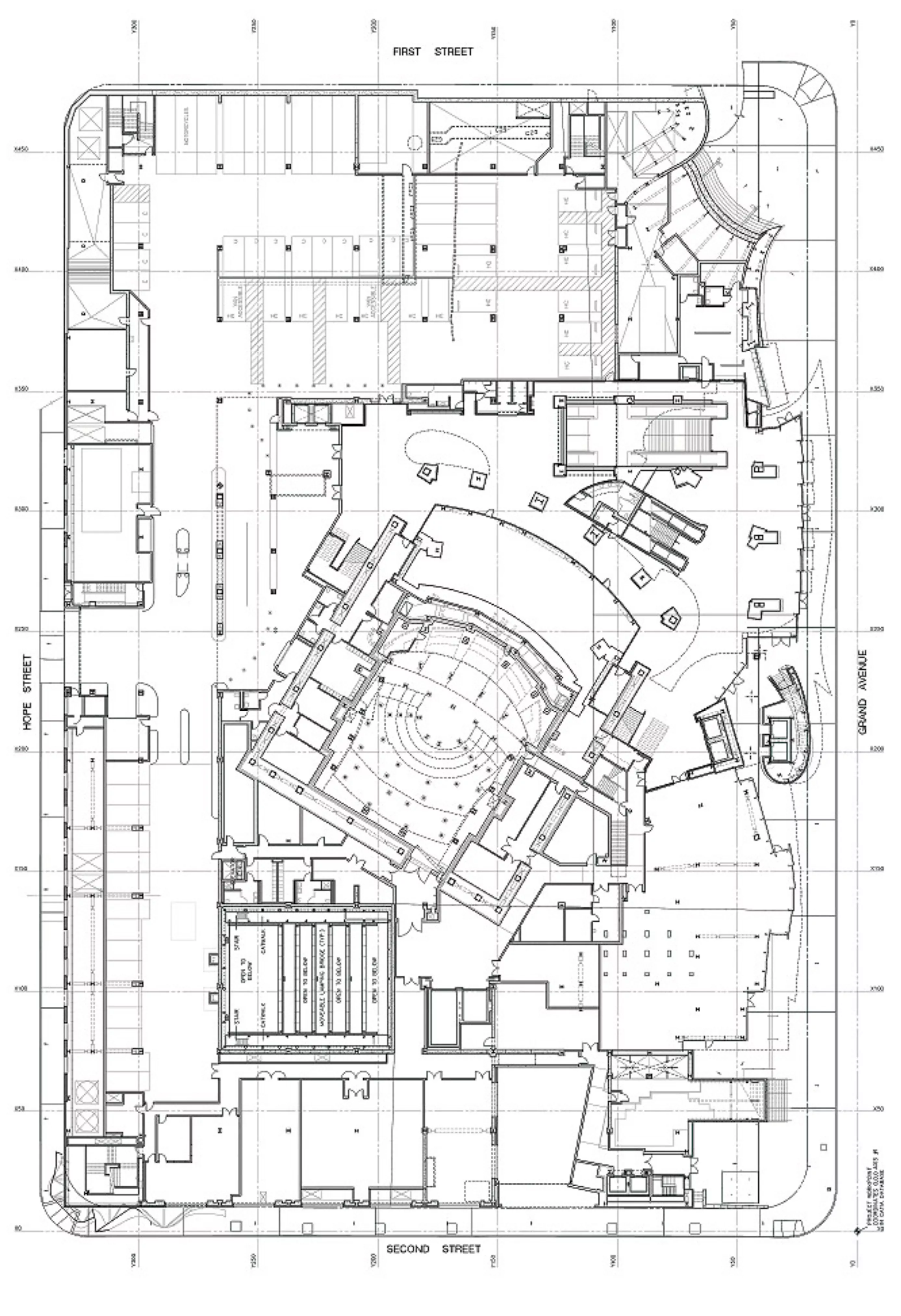
Inside the corrugated metal shell and the seeming disorder, is developing the program in four functional levels. The main access is via a large public space that is generated in the same spot. The main entrance connects with the existing facilities of the Music Center. A secondary access, located at the corner formed by the streets Second Street and Grand Avenue, provides a direct access to the gardens. The hall is accessible from the street. From there we reach the various spaces of the complex.

At the field level is located an area of 3,000 m2 for exhibitions, along with a restaurant and service areas. On the north side of the level of access and forming a volume that stands out the set, is located the Founders Room, a space with lounge and cafeteria. Behind and around the box that makes up the auditorium are located support areas and dressing rooms. Towards the south side, on a volume prismatic lengthened, the offices are located. The park has a capacity of almost 2,200 cars and is distributed in 7 levels. From there you can directly access the interior of the building via escalators.

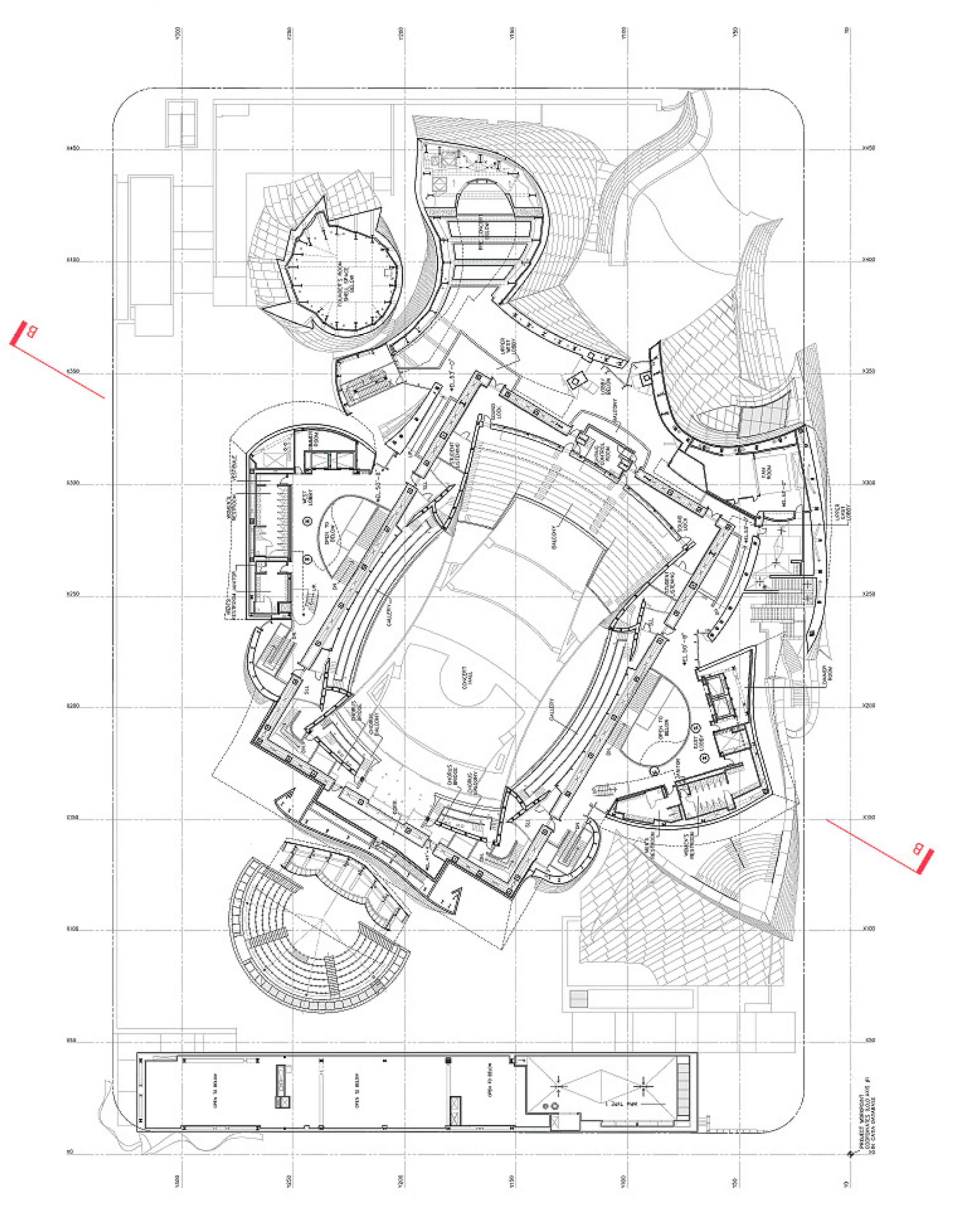
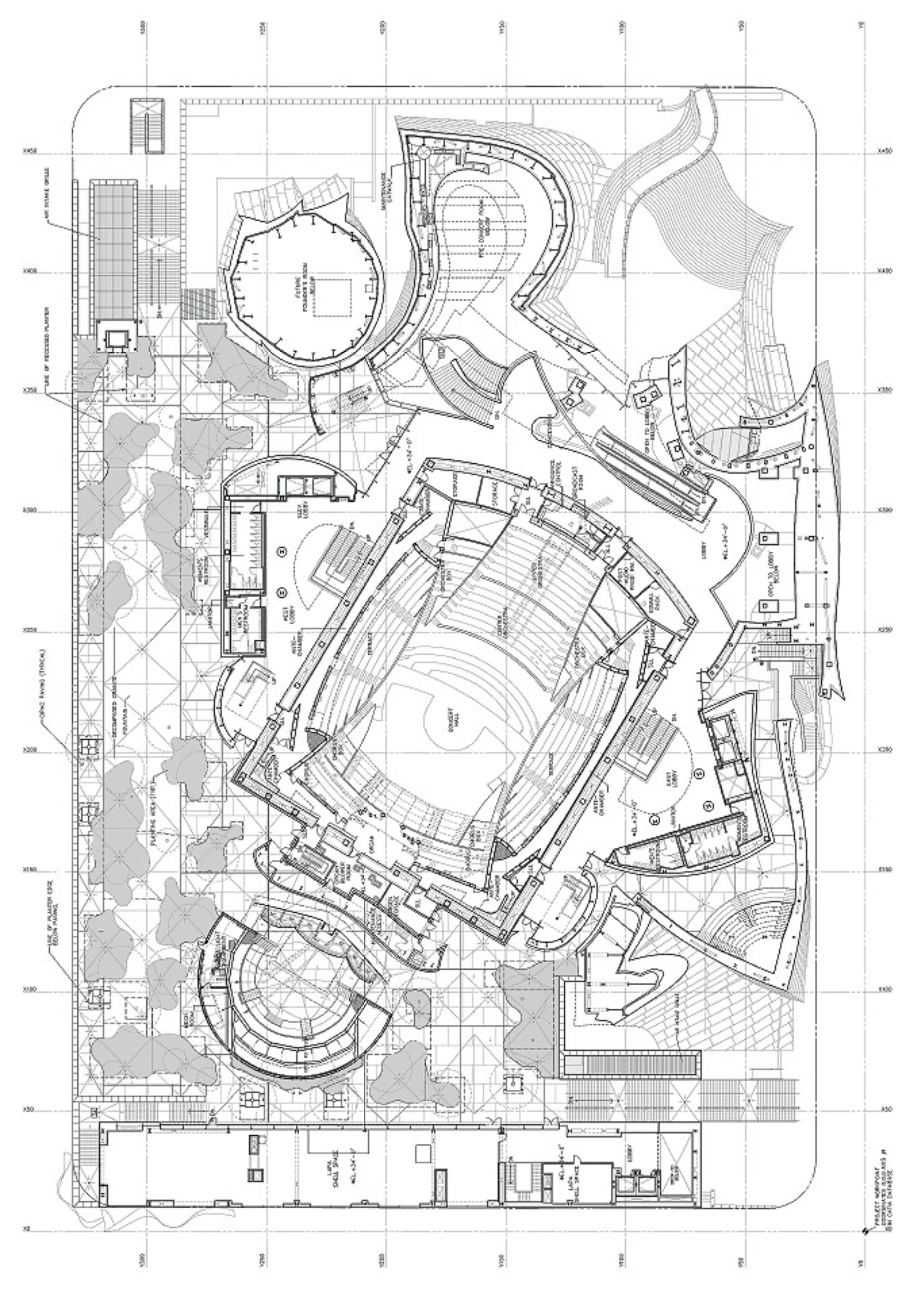
The most important space within the complex is the auditorium for 2265 people. This room was designed with extreme care in the acoustic quality. Yasuhisa Toyota of Nagata Acoustics was responsible for this part together with Gehry. Designed to look like the hull of a ship, the curved wood ceiling evokes the sails of the boat. The auditorium is equipped with natural light, through lucarne and a wide window on the back side of the room. The audience is placed around the orchestra. A body occupies the central position between the blocs of seats in the rear of the stage. The curves of the ceiling and the provision of internal walls improve the acoustics spreading the sound and producing more thoughts, adding warmth and resonance.

Another important area of the complex is the multi-purpose hall Roy and Edna Disney. Is aimed at the California Institute of Arts with capacity for 266 spectators. It has direct access from the street, located in the basement of the complex. The building has also two amphitheaters. The first has 300 seats and is used for children’s shows. The second is a capacity of 120 spectators.
The construction :
Gehry has said that, as with all his buildings, the Walt Disney Concert Hall was designed "from the inside out".
Its plan centers around a large concert hall containing 2,265 seats with a vineyard-style seating arrangement intended to make the audience feel close to the orchestra.
Unlike many traditional concert halls, it does not have boxes and balconies to avoid implied social hierarchies. The room is also column-free, made possible by its large steel roof structure.

The silver waves and arcs that line the exterior were developed later using CATIA, a French computer modeling software. More commonly used by aerospace and automotive industries, the technology allowed Gehry to transfer complicated models of the project into buildable forms and show contractors how his vision could be realized. However, despite the lengthy design process, the studio did not identify the problems the façade would later cause. After installation, the reflective finish of the metal contributed to an increase in traffic accidents, requiring the steel to be sanded to reduce glare.

Due to the mathematical complexity of Gehry's innovative design, he relied on computer software to produce his design in a way that could be completed by contractors. The technology, called CATIA (computer-sided three-dimensional interactive application) is typically used in the design process for French fighter jets, but its mathematical ability aided Gehry in his process of designing the Walt Disney Concert Hall. Perhaps it is the angle-based design of the concert hall that required the use of CATIA, which can be seen on the exterior of the building. For example, the box columns on the north side of the Walt Disney Concert Hall are tilted forward at seventeen degrees. The angular design was used by Gehry to "symbolize musical movement and the motion of Los Angeles".



Comments